- Products ProductsLocation Services
Solve complex location problems from geofencing to custom routing
PlatformCloud environments for location-centric solution development, data exchange and visualization
Tracking & PositioningFast and accurate tracking and positioning of people and devices, indoors or outdoors
APIs & SDKsEasy to use, scaleable and flexible tools to get going quickly
Developer EcosystemsAccess Location Services on your favorite developer platform ecosystem
- Documentation DocumentationOverview OverviewServices ServicesApplications ApplicationsDevelopment Enablers Development EnablersContent ContentHERE Studio HERE StudioHERE Workspace HERE WorkspaceHERE Marketplace HERE MarketplacePlatform Foundation and Policy Documents Platform Foundation and Policy Documents
- Pricing
- Resources ResourcesTutorials TutorialsExamples ExamplesBlog & Release Announcements Blog & Release AnnouncementsChangelog ChangelogDeveloper Newsletter Developer NewsletterKnowledge Base Knowledge BaseFeature List Feature ListSupport Plans Support PlansSystem Status System StatusLocation Services Coverage Information Location Services Coverage InformationSample Map Data for Students Sample Map Data for Students
- Help
Default Styles
HERE provides four default embedded styles to render the basic map primitives:
polygonslinespointstext
Depending on the geometries and attributes that the data source provides, the styles can be used interchangeably. For more information about available layers and their attributes, refer to the Vector Tile REST API documentation.
The following examples illustrate how different styles can be applied to the same data layer. The configurations below use the water layer to render the encoded data with four different styles. These universal styles are embedded and exist for all data layers and properties. A description of each style and associated style attributes is in the corresponding sections below.
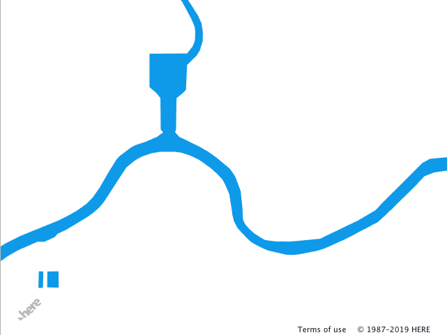
The code below uses the polygon style to render the water polygons of the blue color. The image on the right shows the map after the configuration is set as the H.map.Style of the base map.
Style
sources:
    omv:
        type: OMV
        max_zoom: 17
        min_display_zoom: 1
layers:
    water_areas:
        data: {source: omv, layer: water}
        draw:
            polygons:
                order: 1
                color: [0.055, 0.604, 0.914, 1.00]
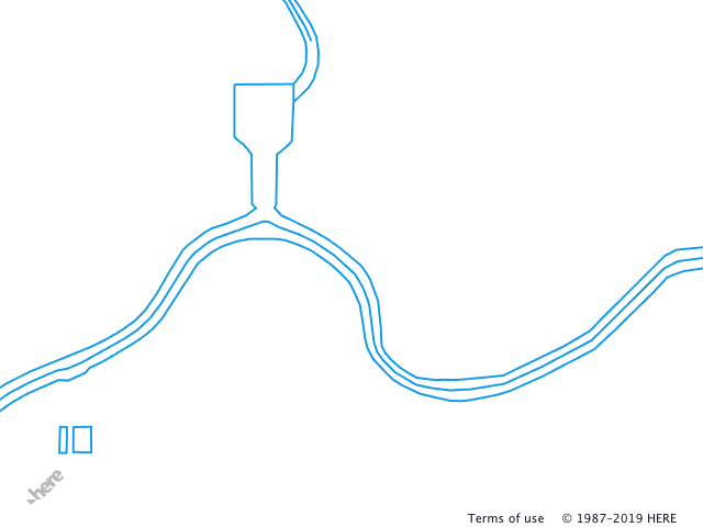
Changing the polygons style to lines allows you to render the outlines of the data encoded in the data layer.
Style
sources:
    omv:
        type: OMV
        max_zoom: 17
        min_display_zoom: 1
layers:
    water_areas:
        data: {source: omv, layer: water}
        draw:
            lines:
                order: 1
                width: 2px
                color: [0.055, 0.604, 0.914, 1.00]
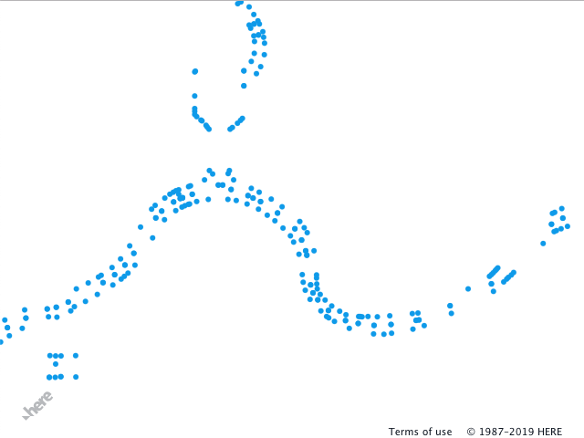
You can also apply the points style to the same data that renders points in place of the geometry vertices. The style defines the size and color of each point. Note that to see all vertices, the collide property of the style must be set to false.
Style
sources:
    omv:
        type: OMV
        max_zoom: 17
        min_display_zoom: 1
layers:
    water_areas:
        data: {source: omv, layer: water}
        draw:
            points:
                collide: false
                size: 6px
                color: [0.055, 0.604, 0.914, 1.00]
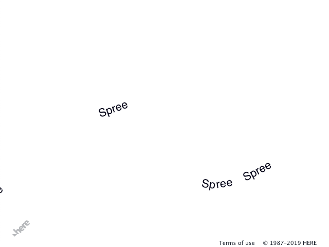
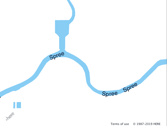
If the data layer provides properties that can have a textual representation, you can also apply the text style to the layer. In the example below, the water data layer contains the name property that represents the name of the water feature. Note that for the text style, the name property is selected for rendering. You can, however, select any property - refer to the corresponding chapter of this guide for more information.
Style
sources:
    omv:
        type: OMV
        max_zoom: 17
        min_display_zoom: 1
layers:
    water_areas:
        data: {source: omv, layer: water}
        draw:
            text:
                collide: false
                font:
                    fill: rgba(0, 0, 20, 1.0)
                    size: 22px
You can apply several styles to the same data layer within the logical layer. In the example below, polygons and text styles were used to render the label information above the water polygons.
Style
sources:
    omv:
        type: OMV
        max_zoom: 17
        min_display_zoom: 1
layers:
    water_areas:
        data: {source: omv, layer: water}
        draw:
            polygons:
                order: 1
                color: [0.055, 0.604, 0.914, 0.50]
            text:
                collide: false
                text_source: function() {return feature.name}
                font:
                    fill: rgba(0, 0, 20, 1.0)
                    size: 22px
polygons
The polygons style can be used with the data layer that contains closed shapes. The polygons style cannot be used with open shapes.
-
color-string, function, mandatory. The property indicates the color of the feature. The string follows the CSS format of the color definitions and can take following forms:- CSS named colors
-
[r, g, b, a]- array that contains RGBA values in the range0...1 -
'#RRGGBB'- RGB hex string -
rgb(R, G, B)- CSS rgb color in the range0...255or0%...100% -
rgba(R, G, B, A)- CSS rgb color in the range0...255and alpha channel in the range0...1
draw:
  polygons:
    color: rgb(255, 0, 0)
- extrude -
boolean, integer, [min, max], function, optional. The property indicates if the polygon must be extruded along the Z axis (for example it might be used to extrude building outline polygon). The default value isfalse.-
boolean- when set totrue, the extrusion height is taken from the height property of the feature. -
integer- extrusion height in meters -
[min, max]- the range defines that the polygon extrusion must start atminmeters over the ground and that the polygon must be extruded up tomaxmeters over the ground. -
function- function that returns the number, for more information see [Functions].
-
-
interactive-boolean, optional. The property indicates whether the feature can be accessed vie the API call (for example,H.Map.getObjectAtcall). The default value isfalse. -
order-integer, function, mandatory. The property defines the rendering order of the logical layers. Layers with the higher values appear on top. -
style-string, optional. The property references the style defined in thestylessection of the configuration. For more information, see Custom Styles. -
visible-boolean, optional. The property indicates if the feature is rendered. The default value istrue.
lines
The lines style can be used with the layers that contain either open or closed shapes.
-
dash-[...number], optional. The property contains an array of numbers and describes the dash pattern used to render the lines. It follows the general logic of the SVG dash-array. For example, the following snippet defines the dash length 2 units long with the 1 unit gaps.
draw:
  lines:
    dash: [2, 1]
-
cap-string, optional. The property sets the shape of the line's ends and could take valuesbutt,squareandround. The default value isbutt. -
color-string, function, mandatory. The property indicates the color of the feature. The string follows the CSS format of the color definitions and can take the following forms:- CSS named colors
-
[r, g, b, a]- array that contains RGBA values in the range0...1 -
'#RRGGBB'- RGB hex string -
rgb(R, G, B)- CSS rgb color in the range0...255or0%...100% -
rgba(R, G, B, A)- CSS rgb color in the range0...255and alpha channel in the range0...1
draw:
  lines:
    color: rgb(255, 0, 0)
-
extrude-boolean, integer, [min, max], function, optional. The property indicates if the polygon must be extruded along the Z axis (for example, it might be used to extrude building outline polygon). The default value isfalse.-
boolean- when set totrue. the extrusion height is taken from the height property of the feature. -
integer- extrusion height in meters -
[min, max]- the range defines that the polygon extrusion must start atminmeters over the ground and it is extruded up tomaxmeters over the ground. -
function- function that returns the number, for more information see the [Functions].
-
-
interactive-boolean, optional. The property indicates whether the feature can be accessed vie the API call (for example,H.Map.getObjectAtcall). The default value isfalse. -
join-string, optional. The property defines the shape of the line joints and can take valuesbevel,roundandmiter. The default value ismiter. -
miter_limit-integer, optional. The parameter defines maximum length of themiterjoin. The default value is3. -
offset-float, [...[zl, float]], optional. The parameter sets the offset of the line segment in meters (m) or pixels (px). The offset is applied normal to the original segment orientation. The possible formats are:- A floating point number that is used across all zoom levels.
-
An array of two-element arrays, where first element is the zoom level and the second element defines the offset. In the following example, offset is 10px at the zoom level 16 and 4px at the zoom level 19.
draw:
lines:
  offset: [[16, 10px], [19, 4px]]
-
order-number, function, mandatory. The property defines the rendering order of the logical layers. Layers with the higher values appear on top. -
outline- block level element that defines the outline style of the line. It can contain anylinesstyle parameters. The following example defines a 1 pixel black outline for the 3 pixel blue polyline.
draw:
  lines:
    order: 1
    width: 3px
    color: [0.055, 0.604, 0.914, 1.00]
    outline:
      width: 1px
      color: rgb(0, 0, 0)
-
style-string, optional. The property references the style defined in thestylessection of the configuration. For more information, see Custom Styles. -
visible-boolean, optional. The property indicates whether feature is rendered. The default value istrue. -
width-float, [...[zl, float]], function, mandatory. The property defines width of the line. The width could be in meters -mor pixels -px. The possible formats are:- A floating point or integer number, that is applied across all zoom levels.
-
An array of two-element arrays, where first element is the zoom level and the second element defines the width. In following example, the width of the line is 5 pixels at the zoom level 15 and 15 pixels at the zoom level 18:
draw: lines: width: [[15, 5px], [18, 15px]] - A function that returns a floating point number.
points
The points style can be used to visualize open and closed shapes or set of points. The style draws a circle with the defined size in the location of the data point.
-
anchor-string, [...string], optional. The property defines the side of the geometry on which the feature must be rendered. Possible values arecenter,left,right,top,bottom,top-left,top-right,bottom-left, andbottom-right. When the parameter value is defined as an array of strings, the renderer uses the first anchor where the feature does not collide with others. The default value is['bottom', 'top', 'right', 'left']. -
collide-boolean, optional. The property changes the collision detection setting. When set tofalse, intersecting points are discarded during the rendering. The default value istrue. -
color-string, mandatory. The property indicates the color of the feature. The string follows the CSS format of the color definitions and can take following forms:- CSS named colors
-
[r, g, b, a]- array that contains RGBA values in the range0...1 -
'#RRGGBB'- RGB hex string -
rgb(R, G, B)- CSS rgb color in the range0...255or0%...100% -
rgba(R, G, B, A)- CSS rgb color in the range0...255and alpha channel in the range0...1draw: points: color: rgb(255, 0, 0)
-
flat-boolean, optional. The property indicates if the point must be projected into the world space. When set totrue, the point representation will appear "flat" on the map surface and will respond to camera movements accordingly. -
interactive-boolean, optional. The property indicates whether the feature can be accessed through the API call (for exampleH.Map.getObjectAtcall). The default value isfalse. -
offset-[integer, integer], [...[zl, [integer, integer]], optional. The parameter shifts the point from the position defined in the data layer. The offset is defined in screen pixels (px) and can be applied to the point feature itself or to thetextblock element of the point feature. The offset can be also defined as an array of two element arrays, where the first element is the zoom level and the second element is[x, y]pixel coordinates. In the following example, the offset is 10 pixels on the X-axis for the zoom level 15 and -10 pixels for the zoom level 16.
draw:
  points:
    offset: [[15, [10px, 0px]], [16, [-10px, 0px]]]
-
order-number, function, mandatory. The property defines the rendering order of the logical layers. Layers with the higher values appear on top. -
outline- block level element that defines the outline style of the line. It can contain anylinesstyle parameters. The following example defines a 1 pixel black outline for the 3 pixel blue polyline.
draw:
  points:
    order: 1
    size: 3px
    color: [0.055, 0.604, 0.914, 1.00]
    outline:
      width: 1px
      color: rgb(0, 0, 0)
-
placement-string, optional. The parameter defines the placement of the point when the data layer contains polygons or lines data. Possible values are:-
vertex- places points on the line or polygon vertices. -
midpoint- places points on the geometry segment midpoint. -
spaced- places points along the geometry with the intervals between points provided in theplacement_spacingproperty. -
centroid- places the point at the geometry centroid. The data layer must provide polygons.The default value is
vertex.
-
-
placement_min_length_ratio-integer, [...[zl, integer]], function, optional. The parameter defines the ratio between the geometry's segment (applicable only for lines and polygons) and the point size. The parameter is used to prevent points rendering on the segments that are smaller than the point itself. -
placement_spacing-float, [...[zl, float]], function, optional. The parameter defines the distance in screen pixels (px) between two points and is used when theplacementproperty is set tospaced. The default value is80px. -
priority-integer, function, optional. The parameter defines the drawing priority of the feature. Lower number indicates higher priority, features with the higher priority are drawn first and have more chance to be rendered. The default value isNumber.MAX_SAFE_INTEGER. -
size-integer, [integer, integer], [...[zl, integer]], [...[zl, [integer, integer]]], optional. The parameter defines the size of the point inpxor%. When the value is set to a single integer, for example,6px, the point with a 6-pixel diameter is rendered. If the parameter is set to an array of two integer values, for example,[5px, 10px], an ellipsoid is rendered with a diameter of 5 pixels on the X-axis and 10 pixels on the Y-axis. -
style-string, optional. The property references the style defined in the styles section of the configuration. For more information, see Custom Styles. -
text- optional. The parameter represents the block level element that defines the rendering of the text label associated with the point. All parameters of thetextstyle can be used in this block. -
visible-boolean, optional. The property indicates if the feature is rendered. The default value istrue.
text
The text style places a text label for the geometry and can be used with open or closed geometries or points. When the style is used with the open geometry (for example, line), the label is placed along the line. If the polygon is used as a source geometry, the text is placed in the centroid.
-
align-string, optional. The property sets the alignment of the text for the multiline labels. Possible values areleft,centerandright. The default value iscenter. -
anchor-string, [...string], optional. The property defines the side of the geometry on which the feature must be rendered. Possible values arecenter,left,right,top,bottom,top-left,top-right,bottom-left, andbottom-right. When the parameter value is defined as an array of strings, the renderer uses the first anchor where the feature does not collide with others. The default value is['bottom', 'top', 'right', 'left']. -
background- optional. The property defines text box background.-
color-string, function, mandatory. The property indicates background color of the text box. The string follows the CSS format of the color definitions and can take the same forms as outline color.
-
-
collide-boolean, optional. The property changes the collision detection setting. When set tofalse, intersecting text labels are discarded during the rendering. The default value istrue. -
font- mandatory. Block level element that defines the appearance of the font.-
family-string, optional. The parameter sets the typeface. The default value isHelvetica. -
fill-string, optional. The property indicates the color of the text and follows the general color definition rules. The default value iswhite. -
size-integer, mandatory. The parameter defines the size of the text, possible units arepx,ptandem. -
stroke-{color: string, width: integer}, optional. The parameter defines the color and width of the font outline. The following example set the stroke width to 2 pixels and the color the blue:draw: text: font: size: 20px stroke: color: blue width: 2Color and width follow the general rules outlined in the
sizeandcolorproperties. -
style-string, optional. The parameter defines the font style, the values could beitalicandnormal. The default value isnormal. -
transform-string, optional. The parameter transforms the text into uppercase or lowercase register and takeslowercaseanduppercaseas values, respectively.
-
-
interactive-boolean, optional. The property indicates whether the feature can be accessed vie the API call (for example,H.Map.getObjectAt call). The default value isfalse. -
max_lines-integer, optional. The parameter sets the maximum number of lines that the text can occupy, and is taken into consideration only when the text wrapping is enabled (seetext_wrapbelow). -
offset-[integer, integer], [...[zl, [integer, integer]], optional. The parameter shifts the text from the position defined in the data layer. The offset works in the screen pixels (px). It can be also defined as an array of two element arrays, where the first element is the zoom level and the second element is the[x, y]pixel coordinates. In the following example, the offset is 10 pixels on the X-axis for the zoom level 15 and -10 pixels for the zoom level 16.
draw:
  text:
    offset: [[15, [10px, 0px]], [16, [-10px, 0px]]]
-
outline- optional. The property defines the color and width of the text box outline.-
color-string, function, mandatory. The property indicates the color of the outline. The string follows the CSS format of the color definitions and can take the following forms:- CSS named colors
-
[r, g, b, a]- array that contains RGBA values in the range0...1 -
'#RRGGBB'- RGB hex string -
rgb(R, G, B)- CSS rgb color in the range0...255or0%...100% -
rgba(R, G, B, A)- CSS rgb color in the range0...255and alpha channel in the range0...1
-
width-integer, mandatory. The property defines outline width in pixels.
-
-
order-number, function, mandatory. The property defines the rendering order of the logical layers. Layers with the higher values appear on top. -
padding-[integer, integer, integer, integer], [integer, integer], optional. The property defines text padding. It can be specified as an array of 4 elements that definetop,right,bottom, andleftpadding correspondingly or it can be specified as an array of 2 elements that defineverticalandhorizontalpadding. -
priority-integer, function, optional. The parameter defines the drawing priority of the feature. Lower number indicates higher priority, features with the higher priority are drawn first and have more chance to be rendered. The default value isNumber.MAX_SAFE_INTEGER. -
repeat_distance-integer, optional. The property defines the label frequency within the tile boundaries. The distance is measured from the center point of the label and can be treated as a bounding sphere for the currentrepeat_group. The default value is256px. -
repeat_group-string, optional. The property defines the name according to how the labels are grouped. Labels from the different data layers can have the samerepeat_groupname. For these labels, the same repeat_distance is applied. -
style-string, optional. The property references the style defined in thestylessection of the configuration. For more information, see Custom Styles. -
text_source-string, function, [...string|function], optional. The parameter sets the name of the property for the label text. This can be a string literal that is the name of the property, a function that returns the string literal, or an array of strings or functions. In the latter case the first non-null value is used for the label. The default value isname. -
text_wrap-integer, optional. The property sets the number of characters after the wrapped text label. -
visible-boolean, optional. The property indicates whether the feature is rendered. The default value istrue.